One collection. Different packaging roles.
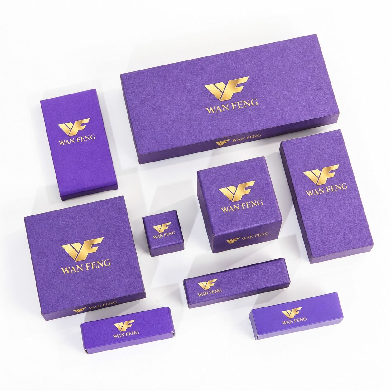
A product range rarely fits into one box size. Small accessories, individually packed items and larger gift assortments each call for different proportions, yet the collection should still be recognized as one brand. This purple packaging direction answers that design brief with a shared visual identity across square, rectangular and compact folding formats. The collection places the WAN FENG identity at the center of the presentation and uses a restrained purple-and-gold palette to connect the range.
The design challenge
The challenge is consistency across different jobs. A broad presentation lid offers room for a larger brand mark, while a narrow carton has a much smaller graphic area. The structure also changes the way a pack is assembled, opened and displayed. Treating every format as a scaled copy would overlook those differences. A coordinated system instead gives each box its own layout while retaining common colors, visual hierarchy and finishing references.
A unified visual identity
The purple surface forms the collection’s dominant visual element. Gold-colored WAN FENG marks provide a clear focal point, while the limited use of secondary graphics keeps the presentation controlled. On the broad rectangular box, the mark sits within generous negative space. The square formats use a more compact identity arrangement, and the narrow formats adapt the horizontal layout to their available panel width. This makes the collection feel related without forcing every format into the same composition.
Inside the packaging collection
The broad rectangular format can serve as a presentation pack for a coordinated assortment, with its interior developed around the selected products. Medium square formats offer a more compact presentation for individual items or smaller combinations. The small square format provides a separate size within the range, while narrow rectangular cartons accommodate elongated product profiles. These are potential applications of the visible formats; the contents and fit are not established by the image. For development, compare wrapped presentation structures and folding-carton samples separately, then select the paper and board against the actual product weight and opening method.
Specification review before quotation
| Item | What to agree | Approval reference |
|---|---|---|
| Structure & dimensions | Internal dimensions, product orientation and opening clearance | Blank structural sample |
| Paper & board | Paper swatch, board construction and color reference | Named material specification |
| Printing & finish | Artwork revision, logo position and surface treatment | Physical printed / finished sample |
| Interior fit | Product support, removal access and insert clearance | Sample with representative products |
| Packing | Surface protection, carton layout and unit count | Approved packing instruction |
Where material meets finishing
The textured appearance brings depth to the purple surface, while the gold-colored identity creates contrast without adding another graphic pattern. To reproduce this direction, trial the proposed wrap paper with both a metallic foil and a printed alternative. Fine lettering, logo edges and coverage over the texture should be checked on the physical sample. The concept image establishes the visual target; a signed paper and finish reference establishes what production is expected to reproduce.
From design approval to production
The collection needs a common design standard and a separate technical record for every format. Begin with the product dimensions and prepare individual dielines. Build blank samples to check the opening, internal space and assembly, then apply the approved artwork to decorated samples. Review the entire range together so differences in purple tone, logo scale or edge treatment are visible before production. Once approved, record the dieline revision, paper reference, logo position, finishing sample and inspection criteria in the production specification.
Check dimensions, opening and product fit.
Review color, logo, surface and assembly.
Record revisions and acceptance criteria.
Agree protection, carton layout and identification.
Protecting the presentation in transit
A coordinated appearance should be maintained through packing as well as manufacturing. Separate the formats by carton identification and specify quantities for each size. Protect large lid surfaces and textured wraps from rubbing against one another. Decide which formats travel assembled and which can be supplied in a space-saving condition after the construction is confirmed. The packing method, destination and arrival requirement then form the basis of the shipment plan.
A coordinated packaging solution
The value of this approach is a packaging family rather than a group of unrelated boxes. Each format has a defined role, while the shared surface and identity connect the retail or gifting presentation. For a buyer, the next step is a coordinated sample set and a format-by-format quotation: dimensions, structure, materials, printing, finish, quantity and packing are reviewed together. This converts the visual collection into a specification that can be approved and checked.